
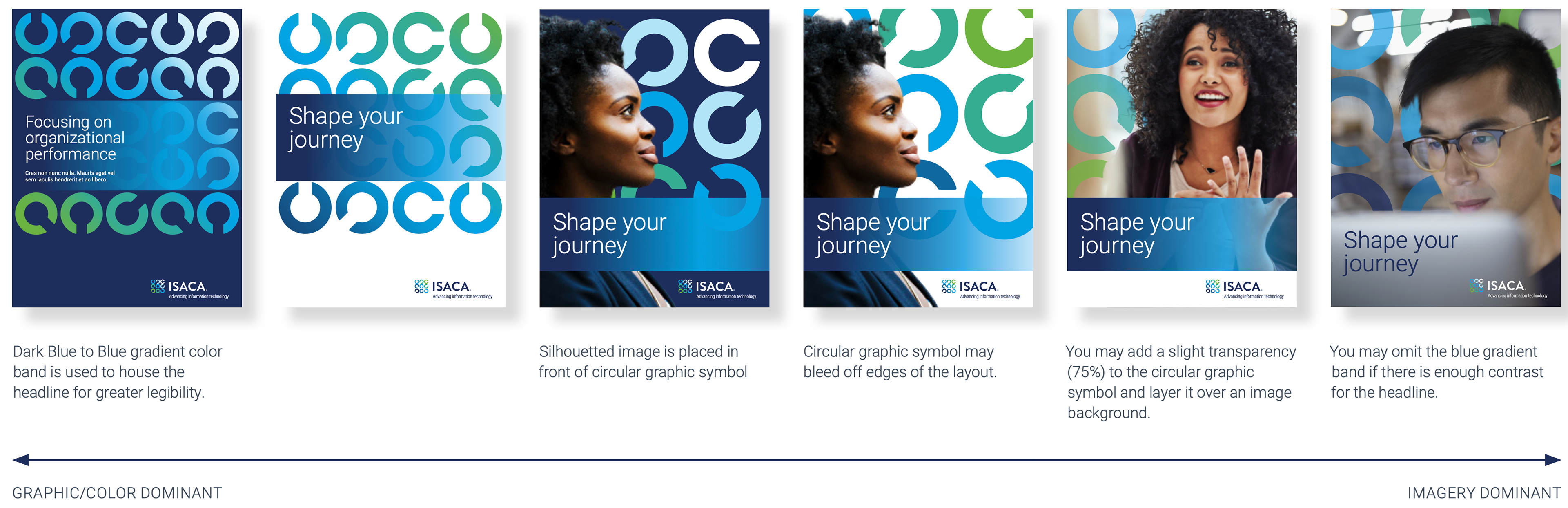
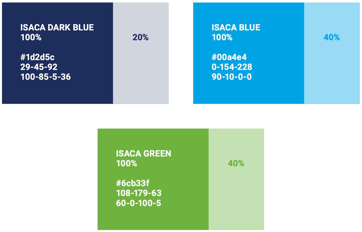
Colors
PALETTE
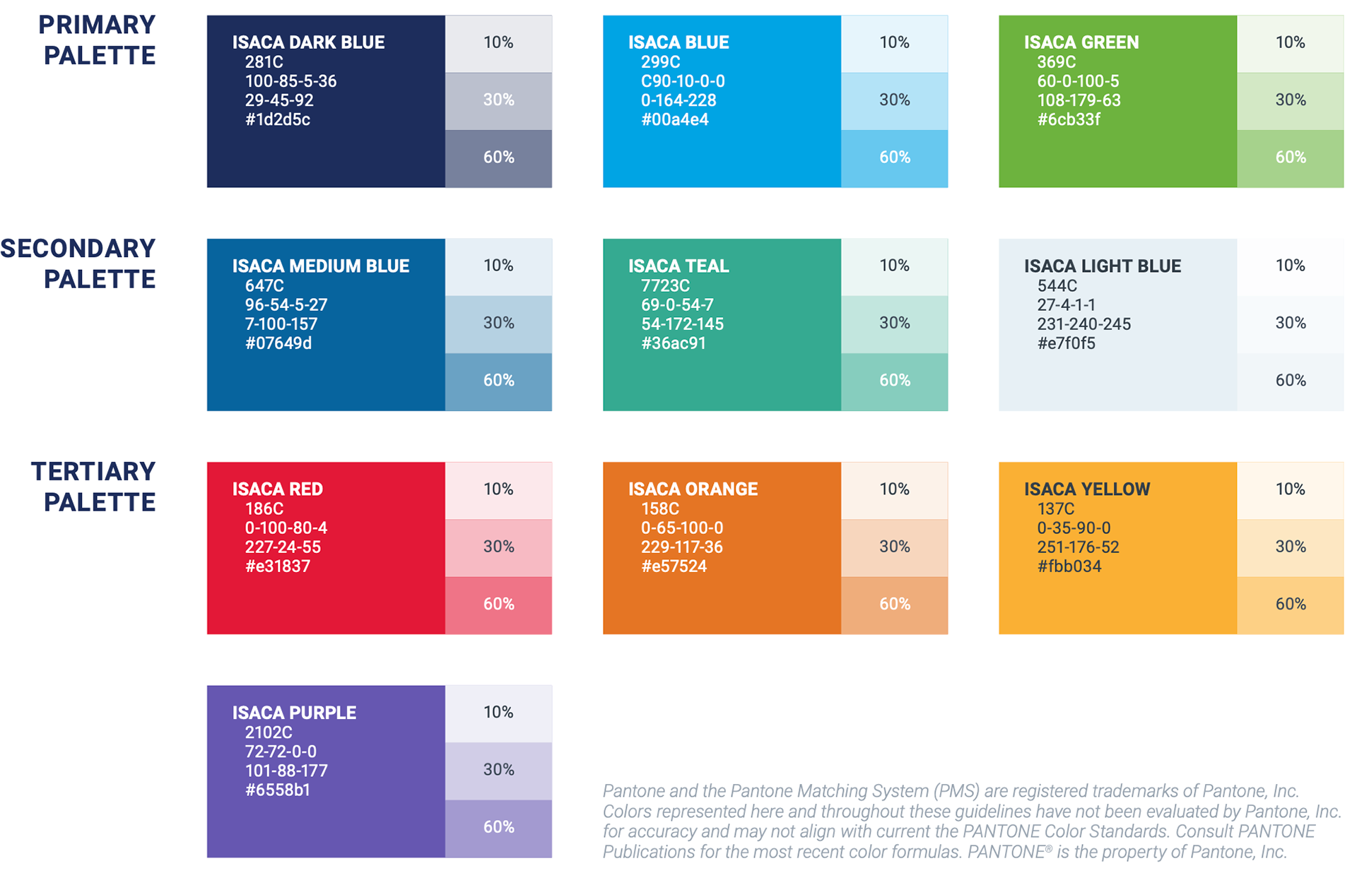
Through the use of color, ISACA communicates the diversity of our activities. Our primary palette is comprised of three colors-with three in the secondary, four in the tertiary, and a full range of 12 greyscale tones.
Through the use of color, ISACA communicates the diversity of our activities. Our primary palette is comprised of three colors-with three in the secondary, four in the tertiary, and a full range of 12 greyscale tones.
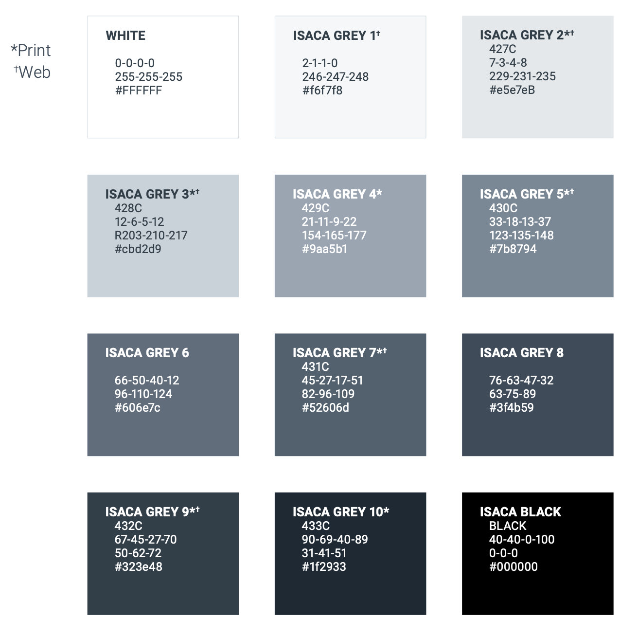
GREYSCALE
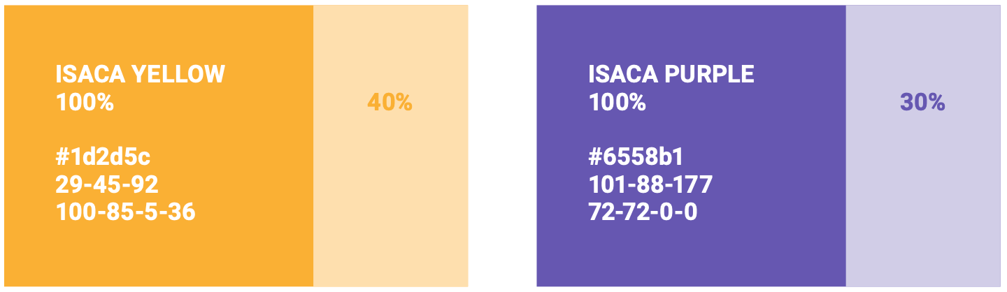
There may be instances that call for a screened tone of a palette color. In those instances, shades should be limited to 10%, 30% or 60%, whenever possible.
There may be instances that call for a screened tone of a palette color. In those instances, shades should be limited to 10%, 30% or 60%, whenever possible.
Accessibility
Accessibility extends beyond the physical considerations or accommodations of physical spaces. It means investing the effort necessary to ensure those with limitations are provided with the access to meet their needs.
Accessibility extends beyond the physical considerations or accommodations of physical spaces. It means investing the effort necessary to ensure those with limitations are provided with the access to meet their needs.
With respect to ISACA's brand visual style, this guide speaks specifically to WCAG 2.1 (Web Content Accessibility Guidelines), Levels AA and AAA documentation and striving to meet the minimum requirements in digital creative materials.
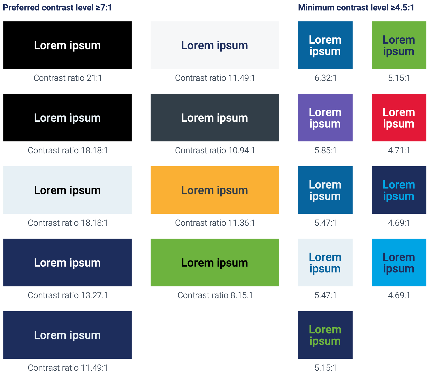
WCAG promotes four principles: Perceivable, Operable, Understandable and Robust.1 The focus here is on Perceivable aspect-specifically the foreground/background color contrast ratio and text size.
ISACA requires that the visual presentation of text and images of text have a preferred contrast ratio of 7:1 (WCAG Level AAA2) and a minimum contrast ratio of at least 4.5:1 (WCAG AA3), except for the following:
large text
Large-scale text and images of large-scale text have a contrast ratio of at least 4.5:13; large text is defined as 14pt/18.66px and bold or larger, or 18pt/24px or larger.
incidental
Text or images of text that are part of an inactive user interface component4, that are pure decoration5, that are not visible to anyone, or that are part of a picture that contains significant other visual content, have no contrast requirement.
LOGOTYPES
Text that is part of a logo or brand name has no contrast requirement
For convenience, acceptable samples utilizing the ISACA color palette are provided. To check other combinations, try consulting a tool.
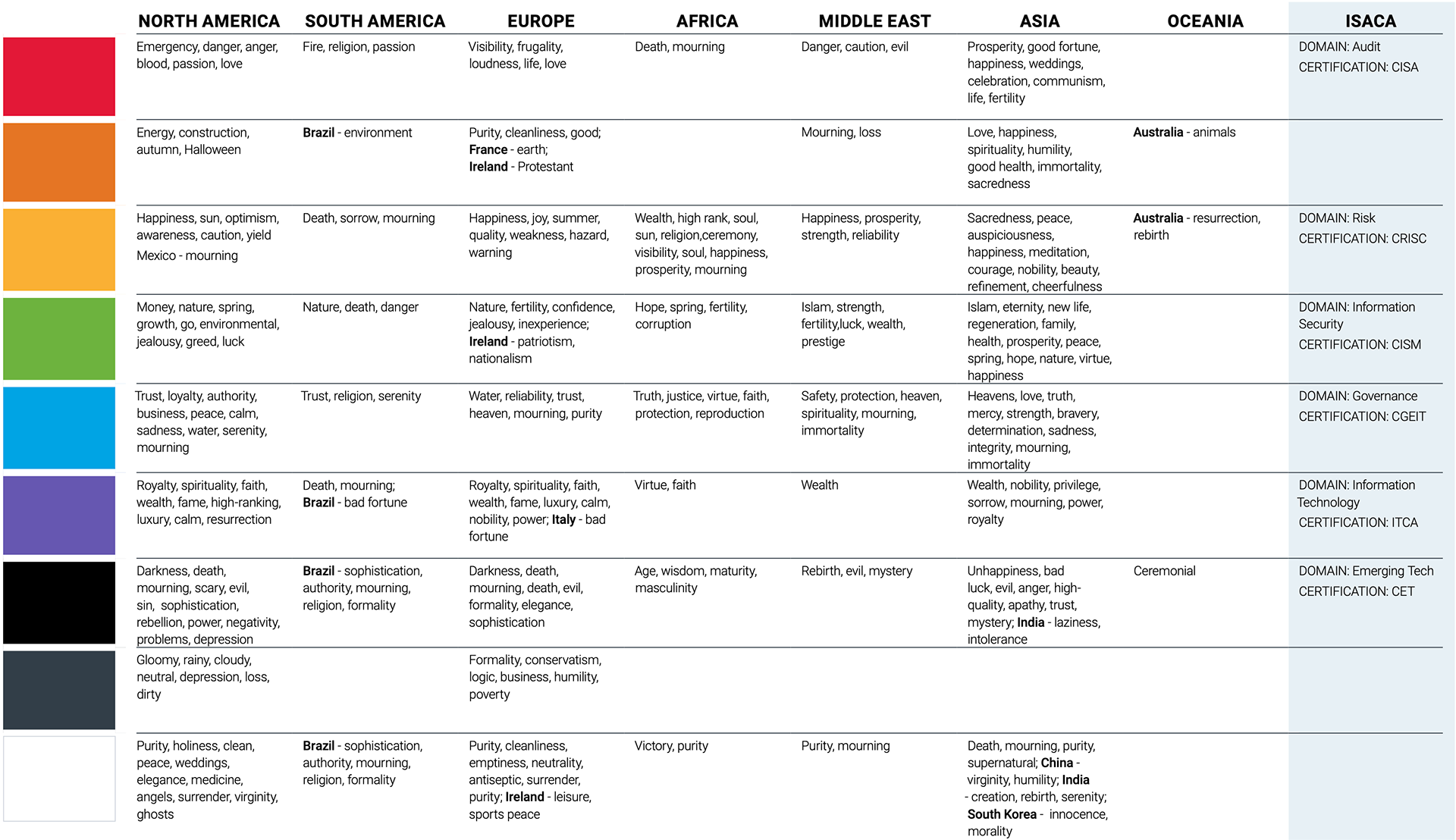
symbolism
The meaning and symbolism of color varies from country to country, culture to culture and sometimes, local region to region. As ISACA's global growth continues, the use of color should be considered.
Weigh the influence of color in the creation of communications-acknowledging that sometimes it may be necessary to alter its use for effectiveness in the final market. There are countless online resources to help in this pursuit. Here are some guidelines to get started.
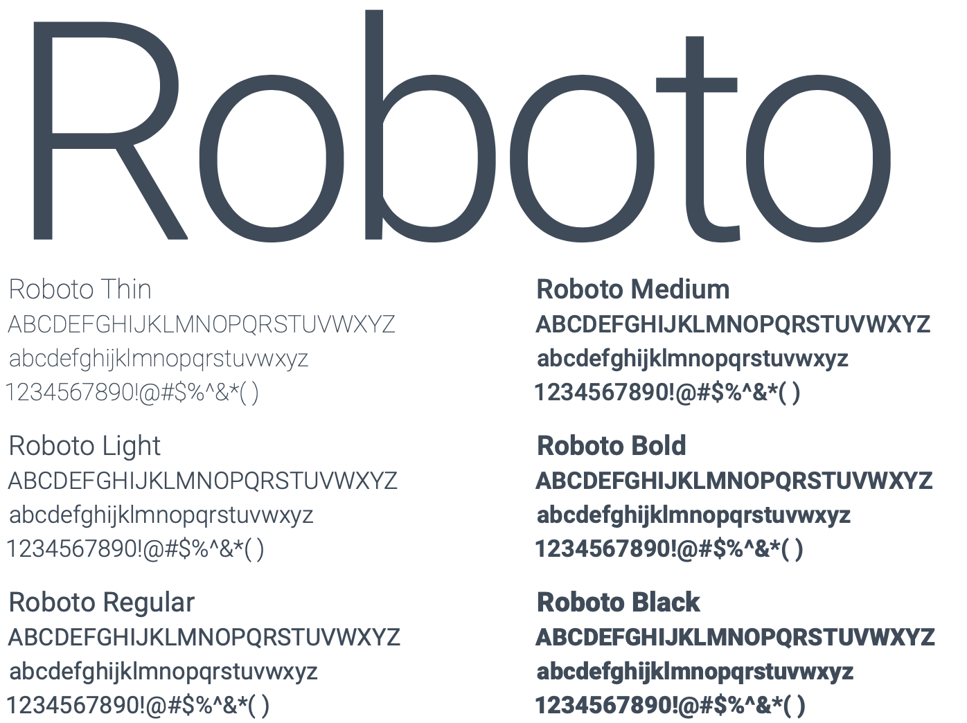
Typography
PRIMARY TYPEFACE
Roboto is ISACA’s primary typeface. The regular, slab and condensed versions may be used in a variety of weights.
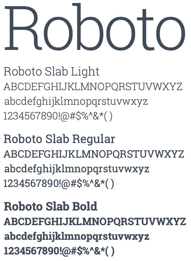
ENHANCEMENT TYPEFACE
Roboto Slab is used to supplement our primary type family and punctuate messaging hierarchy.
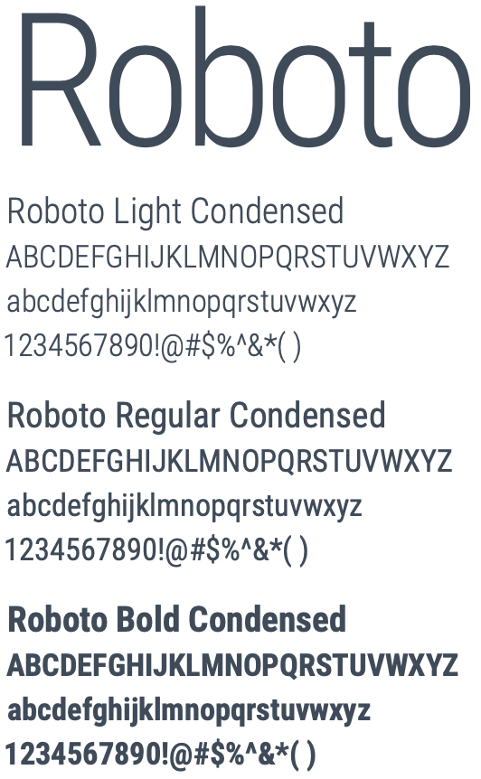
SECONDARY TYPEFACE
Roboto Condensed may be used in a way that is subordinate to the primary font.
Typography hierarchy
There is an information hierarchy to support our brand identity and create consistency across written communications. The selected primary type family is Roboto.
Roboto Slab Light is preferred for headlines, and Roboto Light for body copy (as it is optimized for legibility in copy blocks and at smaller sizes). It is suggested to use Roboto Slab Regular for subheads and Roboto Bold, all caps, for pre-headers, exhibit titles and other set-off types of text.
The Roboto type family provides sufficient variations in font weights and styles to provide ample choices in creating a hierarchy for titles, subheads, footnotes, etc. Maintain a minimum of two points of leading and a full line space after paragraphs.
Set main headlines in sentence case
Roboto Slab Regular subheads, sentence case
PARAGRAPH TITLES IN ROBOTO BOLD, ALL CAPS
Body copy in Roboto Light, flush left, with at least two points leading.
One line space should be used in between paragraphs. Body text is set in dark blue or Grey 9.
For footnotes or smaller text use Roboto Regular or a heavier weight. This is Roboto Medium.
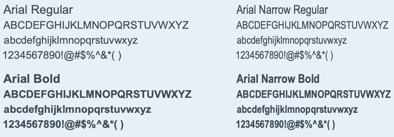
System Typeface: Arial
Arial may be used when creating communications with a solely internal default font (such as the body text on a web page) or for PowerPoint presentations.
Visuals
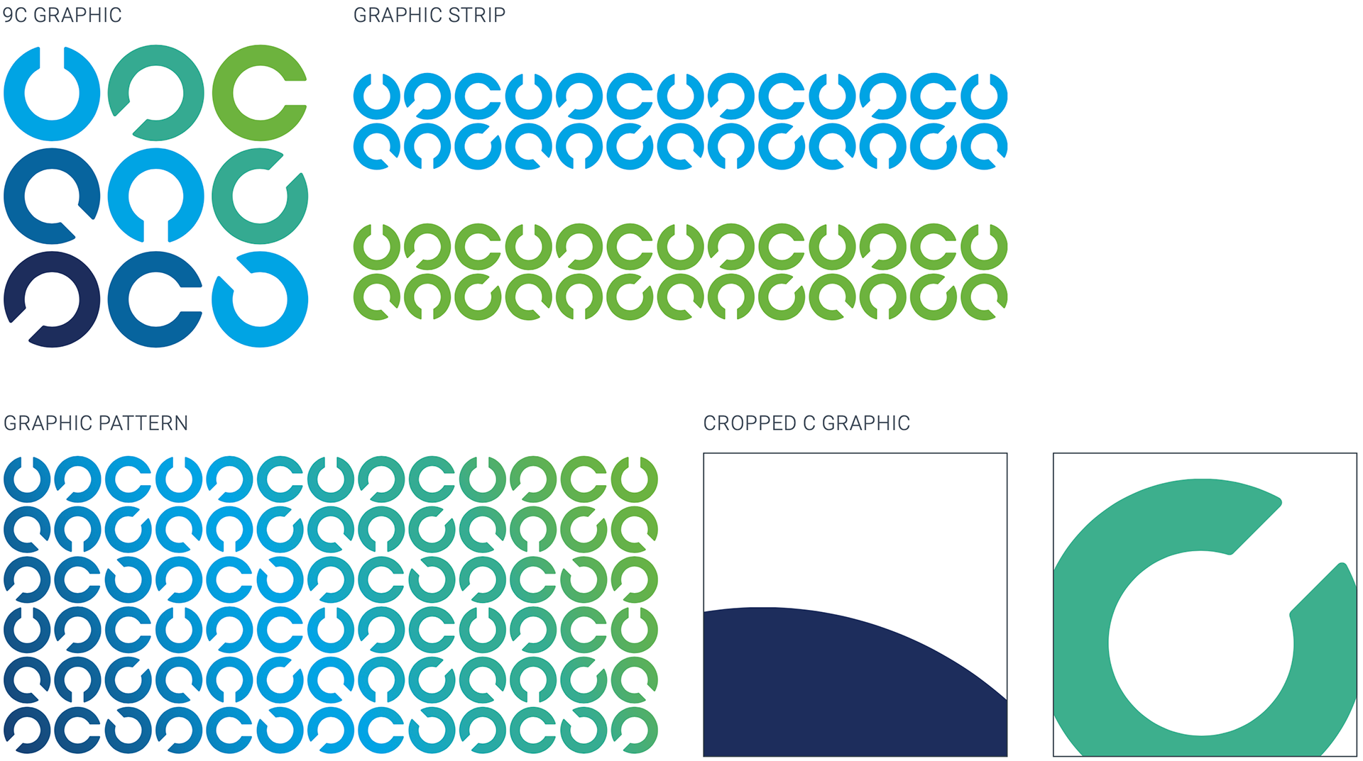
The rotating Cs convey a digital sensibility (and subtly connect back to our certifications/the idea of ‘badging’). They help create a memorable look and feel that build visual equity for our brand.
9C GRAPHIC
The C symbol can be centered within a layout and in close proximity of at least two sides of the application. It can be slightly cropped as long as six circular graphics are still apparent.
Cs GRAPHIC STRIP
Circular graphic strips are created by using several symbols neatly placed within any number of columns or rows. They can be any color or tint from the approved ISACA palette.
Cs GRAPHIC PATTERN
Cs can be used individually or in groups. In creating a custom C graphic, the Cs should always adhere to a grid. All Cs within an application should be the same size and neatly placed into structured rows and columns.
CROPPED C GRAPHIC
The cropped circular graphic is created by cropping any part of the symbol and bleeding it off at least two sides of the application or image. When using this approach the graphic should be used as a big, bold aesthetic.
Static Cs applications
Intersecting C graphics
A relatively new introduction, the intersecting Cs exhibit movement, action, and connection while expanding the ISACA brand. They include a graphic pattern of repeating and overlapping Cs (relating to the 9 Cs logo) as well as a gradient “curve.” This new approach further extends the brand application.
ISACA C
The dynamic and progressive forms of the logo (the Cs) express flexible and continuous learning. The rotating circular graphics convey a digital sensibility. 9 Cs are locked up together to create the ISACA logo and is the keystone of the ISACA brand. These graphics help create a memorable look and feel that builds visual equity for the ISACA brand.

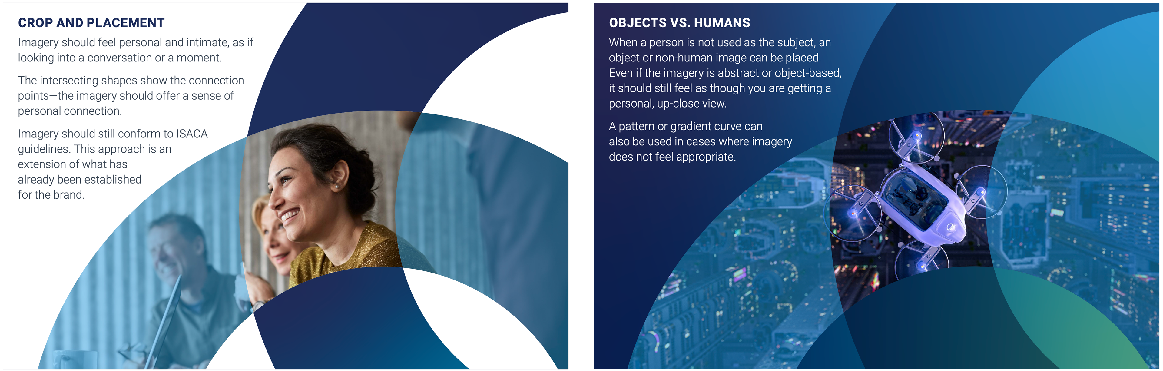
THE WINDOW
By intersecting or overlapping the logo symbol, a “window” is created. This idea plays on the macro and micro scale at which ISACA operates, the breath of resources and products offered and the level of detail that goes into them.
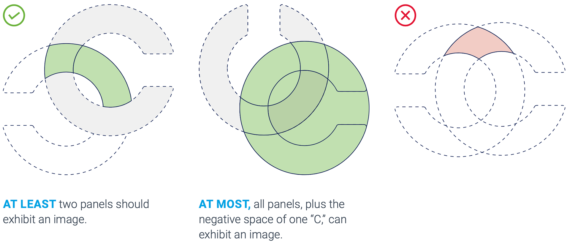
OVERLAP AND FORMAT
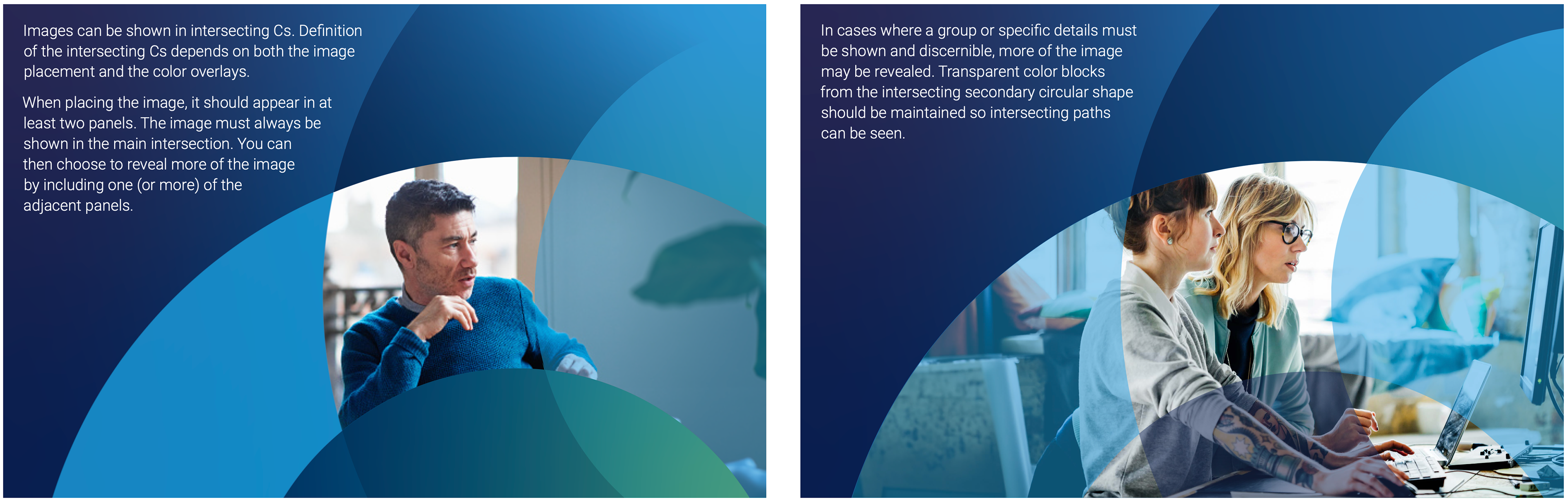
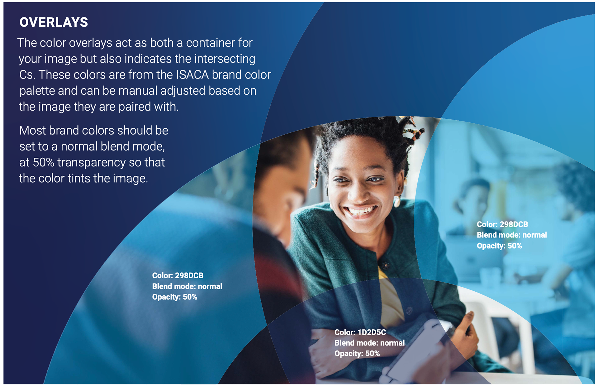
To create a “window,” or reveal, for an image, two ISACA Cs overlap. The Cs must be proportionally same size—not only to represent movement, but also to create ideal shapes for formatting images. View or crop of the intersection of the two C shapes may vary, but must be visible. This can be accomplished between the image and the color overlays. Even if both Cs exhibit an image, the color overlays must maintain the intersection.
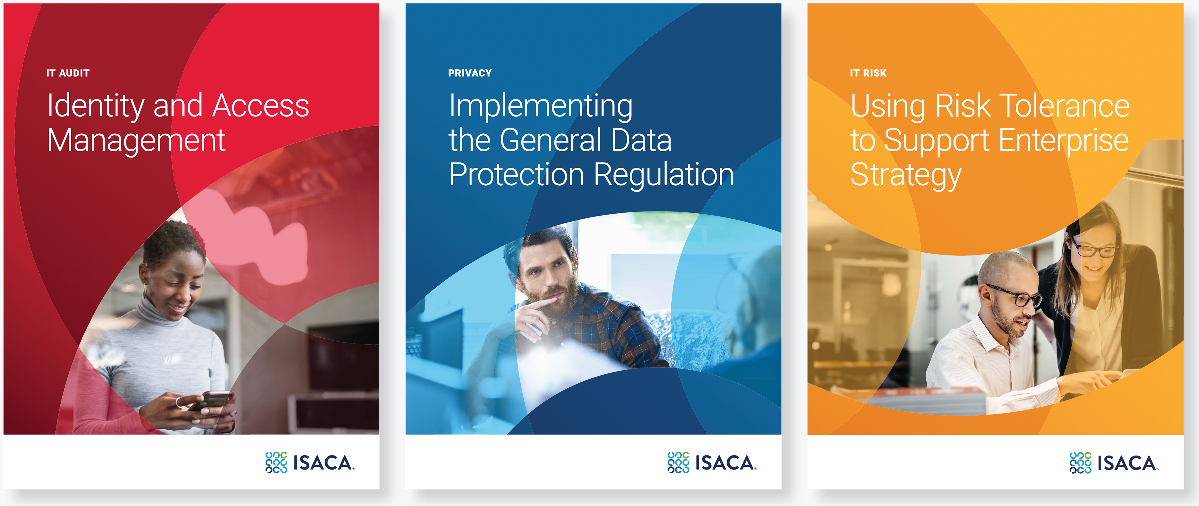
Intersecting C graphics application
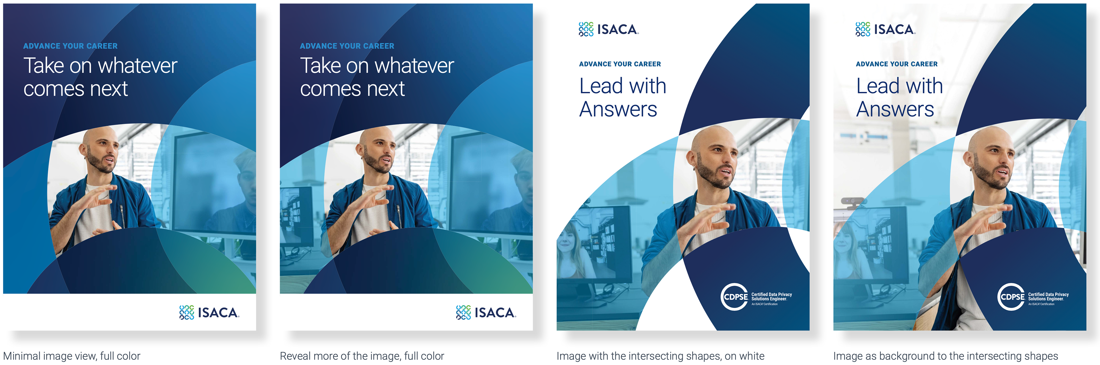
Intersecting C graphics application
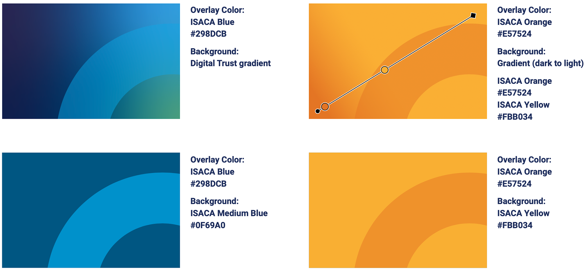
The intersecting Cs can appear on white, on an image or a background color. The color should be within the ISACA brand color palette, work with the overlay color selected. This background can be a flood of a brand color or a simple gradient, overall the layout should have an analogous color scheme.
The gradient curve should not be used, these are separate assets that should not be combined.
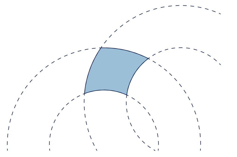
Patterns
THE BASE SHAPE
A graphic pattern that relates to the ISACA Cs and represents connection, network and interaction. The difference is that this is a complete circle (not a C). The graphic has been divided into four equal parts that can build, intersect, and overlap. The format follows a similar theory as the image application (layering, pieces of a whole), but it is formatted differently to add visual variation.
A graphic pattern that relates to the ISACA Cs and represents connection, network and interaction. The difference is that this is a complete circle (not a C). The graphic has been divided into four equal parts that can build, intersect, and overlap. The format follows a similar theory as the image application (layering, pieces of a whole), but it is formatted differently to add visual variation.
PARTS OF A WHOLE
The circular graphic retains the same width and scale of the ISACA C but is woven into a connective chain using the different pieces. When the edges are exposed or not connected to another piece of the graphic, these should be rounded in the same way that the ISACA C is treated.
The circular graphic retains the same width and scale of the ISACA C but is woven into a connective chain using the different pieces. When the edges are exposed or not connected to another piece of the graphic, these should be rounded in the same way that the ISACA C is treated.

GRAPHIC “CHAIN” PATTERN
When imagery is not appropriate or available a pattern element could be used. The colors used should feel analogous. At most, 2 brand colors can be used. These can be paired with shades of those brand colors. When the pattern is used on a color background, white can be used as a supplemental color within the pattern.
When imagery is not appropriate or available a pattern element could be used. The colors used should feel analogous. At most, 2 brand colors can be used. These can be paired with shades of those brand colors. When the pattern is used on a color background, white can be used as a supplemental color within the pattern.


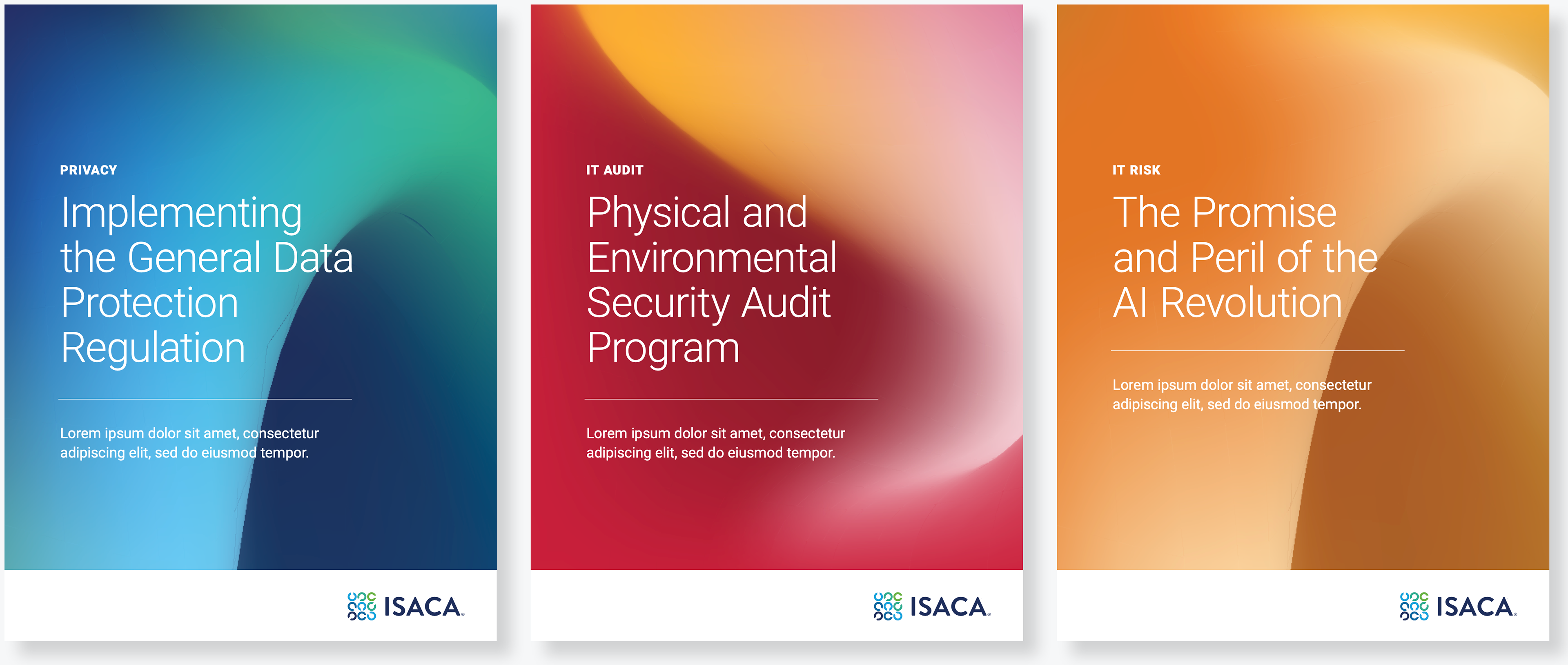
3D ABSTRACT CURVE
In many situations the ISACA brand applies its color palette in a very flat application. Gradients have been brought in for specialty cases, in a similar way we are introducing a gradient application. The graphic “curve” is intended to represent the ISACA C, this treatment offers variety and can be used as an alternate graphic background in situations where an image is not appropriate or necessary.
The different “curve” views represent or relate back to the logo symbol but in a three dimensional way, rather than flat. The application should give the feeling of movement, transformation, growth and pushing those forward.

Imagery
Photography should feel real and natural. Use well- lit, bright photography with light, airy backgrounds whenever possible. People’s expressions and poses should convey confidence and represent our audience as they authentically are.
CONSIDER CHARACTER PHOTOGRAPHY WHEN
• The topic focuses on a real and tangible situation (e.g. a training experience).
• The story is about specific people in a real setting (e.g. featuring a member’s story).
• Authenticity and trust are important components of our message (e.g. interview with experts).
• The topic focuses on a real and tangible situation (e.g. a training experience).
• The story is about specific people in a real setting (e.g. featuring a member’s story).
• Authenticity and trust are important components of our message (e.g. interview with experts).
KEY PRINCIPLES TO KEEP IN MIND WHEN SELECTING PHOTOGRAPHY
Capture a moment
Choose full-color images that capture a spontaneous moment. People should be engaged in an activity. If looking at the camera, they should have a natural, authentic expression.
Capture a moment
Choose full-color images that capture a spontaneous moment. People should be engaged in an activity. If looking at the camera, they should have a natural, authentic expression.
Use variety
ISACA is a global organization with members at every level of experience, and this should be reflected in our photo choices.
ISACA is a global organization with members at every level of experience, and this should be reflected in our photo choices.

Graphics and/or abstracts
Graphic and abstract images should have a sense of momentum or progression, as well as convey the technological essence of the related subject matter.
Graphic and abstract images should have a sense of momentum or progression, as well as convey the technological essence of the related subject matter.
CONSIDER ABSTRACT IMAGES WHEN
• You need to convey a complex idea or technological concept.
• The story is about a general topic or trend (e.g. emerging technology).
• A diverse set of audiences need be able to identify with the situation (e.g. IT/IS leadership).
• You need to convey a complex idea or technological concept.
• The story is about a general topic or trend (e.g. emerging technology).
• A diverse set of audiences need be able to identify with the situation (e.g. IT/IS leadership).
ABSTRACT IMAGES ALSO ALLOW YOU
Mystery
Abstract images trigger emotional responses and imaginations by including an element of mystery and intrigue. This is how abstract art gives viewers a sense of wonder. This, in turn, engages and encourages them to appreciate even the most complex but inviting pieces of art.
Mystery
Abstract images trigger emotional responses and imaginations by including an element of mystery and intrigue. This is how abstract art gives viewers a sense of wonder. This, in turn, engages and encourages them to appreciate even the most complex but inviting pieces of art.
Simplicity
Distracting and useless elements should be absent from the image—especially since what is included in the image won’t be easily recognizable— thus resulting in a cleaner abstract image that is visually lighter and easier to interpret.
Distracting and useless elements should be absent from the image—especially since what is included in the image won’t be easily recognizable— thus resulting in a cleaner abstract image that is visually lighter and easier to interpret.

Montages
Photo montage and double-exposure images connect the human side of ISACA, our members and colleagues, to the technology side of our professions and industry.
Photo montage and double-exposure images connect the human side of ISACA, our members and colleagues, to the technology side of our professions and industry.
CONSIDER PHOTO MONTAGE WHEN
• You need to convey a complex interaction between human(s) and technology.
• You need to bring emotion into a highly sterile technological concept or make technology more accessible.
• You need to convey a complex interaction between human(s) and technology.
• You need to bring emotion into a highly sterile technological concept or make technology more accessible.
CONSIDERATIONS WHEN SELECTING OR CREATING
Focus on the people
When combining technology into photography of a person or people, the human element should be at the forefront. ISACA is concerned most about our global community and ensuring people thrive.
Focus on the people
When combining technology into photography of a person or people, the human element should be at the forefront. ISACA is concerned most about our global community and ensuring people thrive.
Details
Be cognizant of how the abstract technology interacts with the person. Avoid covering eyes, for example, or having abstract elements tangent to the body and face.
Be cognizant of how the abstract technology interacts with the person. Avoid covering eyes, for example, or having abstract elements tangent to the body and face.
Avoid
Avoid overly busy or cliché images. People should be engaged but not directly with the added technological imagery.
Avoid overly busy or cliché images. People should be engaged but not directly with the added technological imagery.

Inclusivity
As ISACA grows globally, it is important to depict a full-spectrum of inclusivity and diversity in communications and advertisement. Inclusive images intentionally represent individuals and groups respectfully and authentically.
As ISACA grows globally, it is important to depict a full-spectrum of inclusivity and diversity in communications and advertisement. Inclusive images intentionally represent individuals and groups respectfully and authentically.
Inclusivity veers from stereotypical representations and reflects equity and equality. It extends beyond ethnicity and/or race to encompass a number of aspects, including these:
• Race and/or ethnicity
• Skin tone Gender and gender expression
• Relationship status Sexual orientation
• Culture and/or customs Disability
• Language Age
• Income and social class Body type, size and shape
• Clothing, including cultural
• Hairstyle and/or head dress or religious specificity
• Race and/or ethnicity
• Skin tone Gender and gender expression
• Relationship status Sexual orientation
• Culture and/or customs Disability
• Language Age
• Income and social class Body type, size and shape
• Clothing, including cultural
• Hairstyle and/or head dress or religious specificity
Ensuring that all peoples are represented requires deliberate effort and will likely take a bit more time. However, reflecting global diversity of all kinds is paramount to ISACA’s mission and continued success.

Illustration
Principles
Use of illustration in communications is encouraged. Good illustration can help explain complex information, making communication more approachable and easy to understand. It can be used across all channels, provided it is adapted for the context in which it appears.
Use of illustration in communications is encouraged. Good illustration can help explain complex information, making communication more approachable and easy to understand. It can be used across all channels, provided it is adapted for the context in which it appears.
When planning an illustration, focus on the core story to simplify the message as much as possible. As a rule, keep in mind that the process of creating an effective illustration typically consists up to 60% of conceptualizing the content/message idea and only 40% actual design work.
ILLUSTRATION PRINCIPLES
Always be useful
Illustration adds information. It provides context, adds clarity, or leads to the next step. It gives the audience a deeper understanding of what they see.
Always be useful
Illustration adds information. It provides context, adds clarity, or leads to the next step. It gives the audience a deeper understanding of what they see.
Keep it in the family
Illustrations are all part of the same visual family. Inconsistencies reduce the overall quality of the experience, and can distract users or make them feel like they’re in the wrong place.
Illustrations are all part of the same visual family. Inconsistencies reduce the overall quality of the experience, and can distract users or make them feel like they’re in the wrong place.
Stay focused
Each illustration should convey one idea. The story is easy to understand, so the audience intuitively understands how to accomplish what they are attempting to do. Every illustration needs to feel Keep it in the family appropriate for the exact situation.
Each illustration should convey one idea. The story is easy to understand, so the audience intuitively understands how to accomplish what they are attempting to do. Every illustration needs to feel Keep it in the family appropriate for the exact situation.
Reflect diversity
Try to include an equal quantity of representation in illustrations, including a balance between gender and age. The representation of different cultures helps people associate themselves with visual content.
Try to include an equal quantity of representation in illustrations, including a balance between gender and age. The representation of different cultures helps people associate themselves with visual content.
elements
ISACA’s illustration style is bold, elegant, and sharp. It is a visual representation of ISACA brand personality. Illustrations help communicate essential messages and are often paired with a product or category or explanation. We use these illustrations consistently and repeatedly to help reinforce the meaning of the illustration in the mind of our customers.
ISACA’s illustration style is bold, elegant, and sharp. It is a visual representation of ISACA brand personality. Illustrations help communicate essential messages and are often paired with a product or category or explanation. We use these illustrations consistently and repeatedly to help reinforce the meaning of the illustration in the mind of our customers.
DO
• Show actions, progress, and relation-ships using dotted lines and arrows.
• Use illustrations at the recommended size.
• Simplify your story and use plenty of white space around illustrations.
• Show actions, progress, and relation-ships using dotted lines and arrows.
• Use illustrations at the recommended size.
• Simplify your story and use plenty of white space around illustrations.
elements Of style
Shapes
Shapes are stroked with a 3px ISACA dark blue line, as are icons. Some may be filled with ISACA primary colors to bring attention to important area. Depth is created by flat rotation.
Shapes
Shapes are stroked with a 3px ISACA dark blue line, as are icons. Some may be filled with ISACA primary colors to bring attention to important area. Depth is created by flat rotation.
Simple geometric shapes with sharp corners build images that are clear and approachable
Representations of people use organic shapes.
Colors
Use clean shapes, ample negative space and balanced color ratios to ensure the scene does not feel busy. Use two tones or primary colors (green and blue with different opacity levels) to highlight different areas, do not use them randomly or within the same object. Main elements can be filled with ISACA dark blue to help focus them. For details, use ISACA Dark blue with a 20% opacity.
Use clean shapes, ample negative space and balanced color ratios to ensure the scene does not feel busy. Use two tones or primary colors (green and blue with different opacity levels) to highlight different areas, do not use them randomly or within the same object. Main elements can be filled with ISACA dark blue to help focus them. For details, use ISACA Dark blue with a 20% opacity.
Lines
All lines should be ISACA Dark blue with a 3px centered stroke.
All lines should be ISACA Dark blue with a 3px centered stroke.
Use dashed lines and gaps to make graphics light. However, do not make gaps too big if shape is not filled.
Details
All lines should be ISACA Dark blue with a 3px centered stroke. Use dashed lines and gaps to make graphics light. However, do not make gaps too big if shape is not filled.
All lines should be ISACA Dark blue with a 3px centered stroke. Use dashed lines and gaps to make graphics light. However, do not make gaps too big if shape is not filled.

WHEN TO USE ILLUSTRATIONS
Illustrations are used across marketing touch points to support a cohesive, clear, and consistent story from start to finish. They should not distract or overshadow the key message. Illustration is more prominent in marketing or content development to help tell stories, and is most commonly used in:
• Websites, landing pages
• Email
• Presentations
• Social media
• Demand assets (banner ads, etc.)
• Infographics, reports, surveys
Illustrations are used across marketing touch points to support a cohesive, clear, and consistent story from start to finish. They should not distract or overshadow the key message. Illustration is more prominent in marketing or content development to help tell stories, and is most commonly used in:
• Websites, landing pages
• Presentations
• Social media
• Demand assets (banner ads, etc.)
• Infographics, reports, surveys
illustration levels
Hero
(full weight screen, intended to tell more complex stories) used for page headers section.
Hero
(full weight screen, intended to tell more complex stories) used for page headers section.
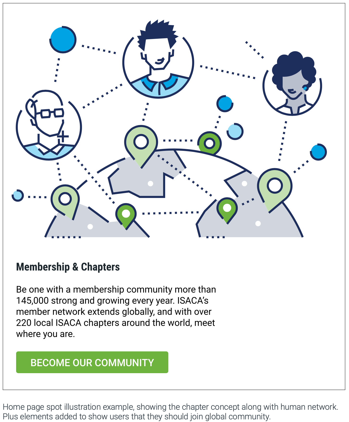
Spot hero
(limited space, simplified versions of heroes, visually and metaphorically) used along text block to support message.
Spot
(the simplest and most literal expression of a concept) usually consist of one object and used as small blocks.
(the simplest and most literal expression of a concept) usually consist of one object and used as small blocks.
Color
Primary ISACA colors with two tones are used for all illustrations.
Primary ISACA colors with two tones are used for all illustrations.
When situation requires, additional colors can be used.